Designing the Chartres Garden
“Strive to have your garden be like nowhere else on earth.”
We interrupt our regularly scheduled programming to bring you . . .
A Johnny’s Garden contest!
Johnny’s Garden follows a very specific posting schedule. Can you figure out the pattern underlying the publishing dates of every post on this blog?
If you guess coreectly, you’ll receive a LIFETIME MEMBERSHIP to Johnny’s Garden.
This lifetime membership offers NO TANGIBLE BENEFITS WHATSOEVER! (until I’m famous and charge people out the ear to read this thing. Boy, then won’t you be glad you won a lifetime membership.)
The answer will be revealed next month, and will be explained in great detail in that month’s post.
Now, back to our regularly scheduled programming.
What I love most about garden design is how a person’s proclivities can meld with the landscape to create something completely unique. As Monty Don says, “Strive to have your garden be like nowhere else on earth.” The mystical part of me gets excited that the garden can be the unique fusion of the human soul with the soul of the earth.
Here’s something unique I’m planning for my garden this year.
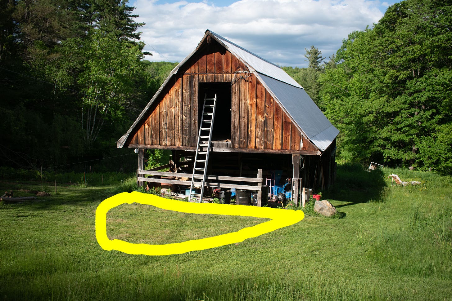
A simple principle of garden layout is to reflect the shape and size of a building onto the ground adjacent to it, to create the shape and size of a garden bed. So a rectangular wall 20 feet high should look nice with a rectangular garden bed 20 feet deep running the length of the wall.
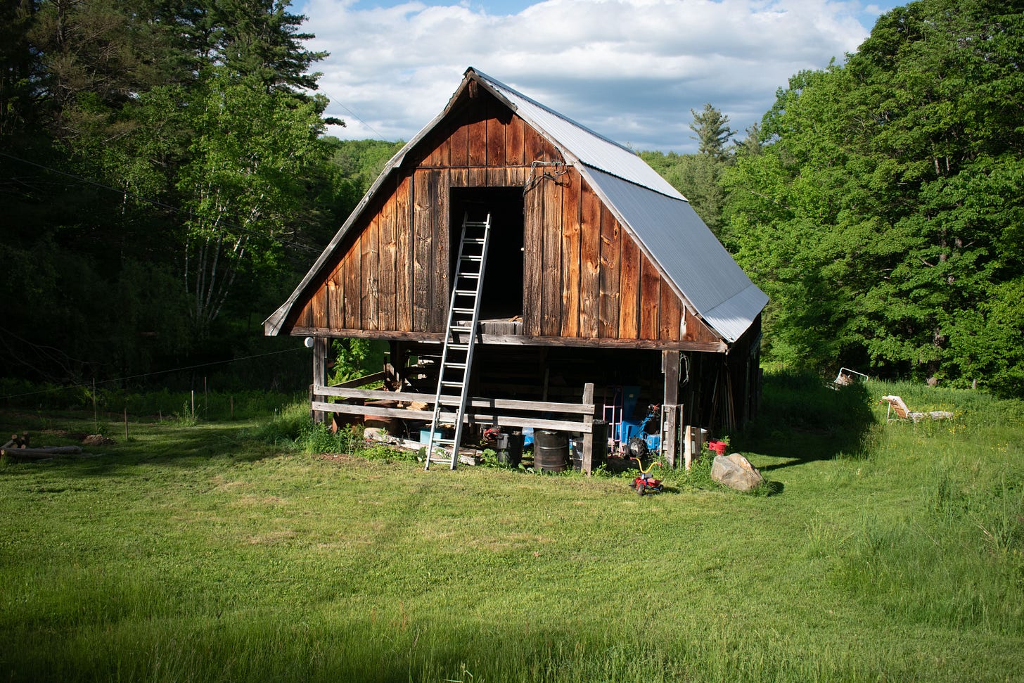
We wanted to put a new garden bed in front of our barn (pictured above), to accent the barn’s antique beauty while screening the unsightly piles of antique junk it contains. I starting by reflecting the arch-like shape and size of the barn onto the ground. The shape not only looked nice when framed against the barn, it also framed two curving paths that followed the routes a person would naturally want to walk. That shape fit perfectly into the setting.
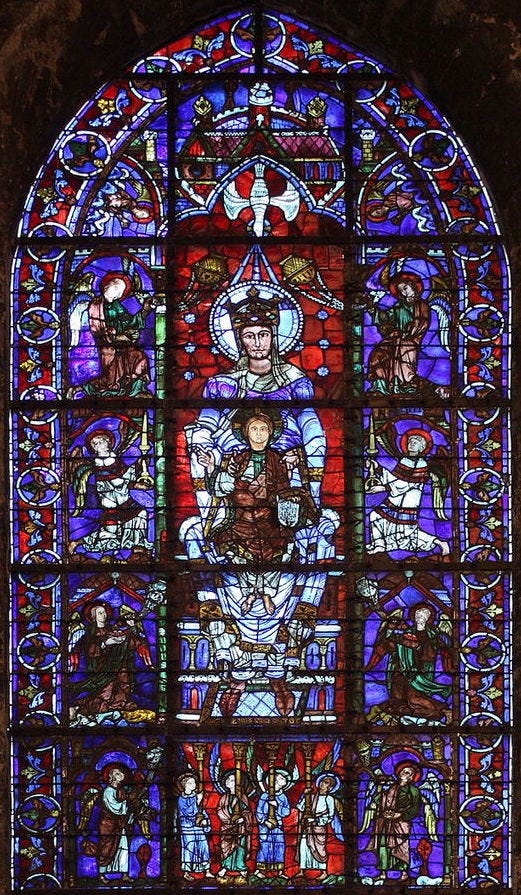
The shape reminded me of a cathedral window, and my favorite cathedral is Chartres, so for the theme of this garden I decided to imitate Chartres’ famous stained glass windows.
The Chartres theme is expressed through three elements in the garden:
1. Blue
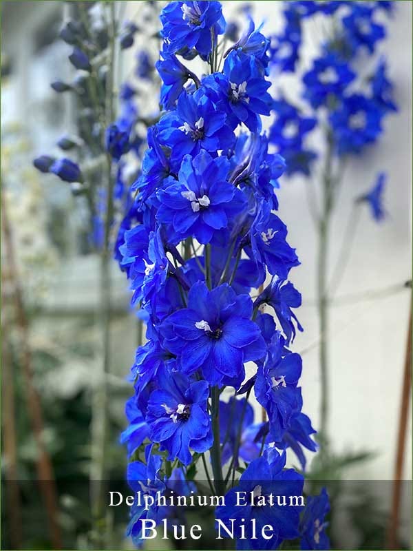
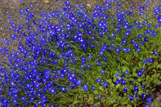
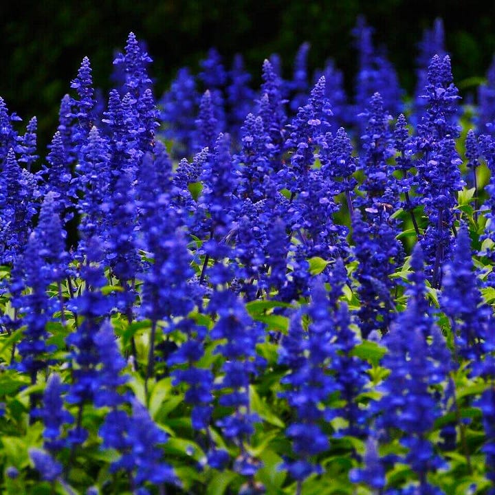
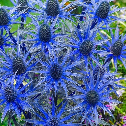
As you can see in the photo above, the stained glass at Chartres is famous for its incredible deep blue.1 Blue is the rarest color in nature, so I thought it would be a fun challenge to have the garden be mostly blue flowers. To imitate the windows, I decided on a rough color breakdown of 70% dark blue, 15% red, and 15% other (mostly white, orange, and light blue). I chose a mix of perennials and annuals to ensure a long flowering season of cobalt and royal blues.
My primary picks include a variety of delphiniums for height, Lobelia erinus ‘Blue Moon’ for groundcover, Salvia farinacea ‘Victoria Blue’ for late-season color, and Eryngium x zabelii ‘Big Blue’ for its awesome blue stems and foliage. You can see my plant list here.
2. Flower shape and texture
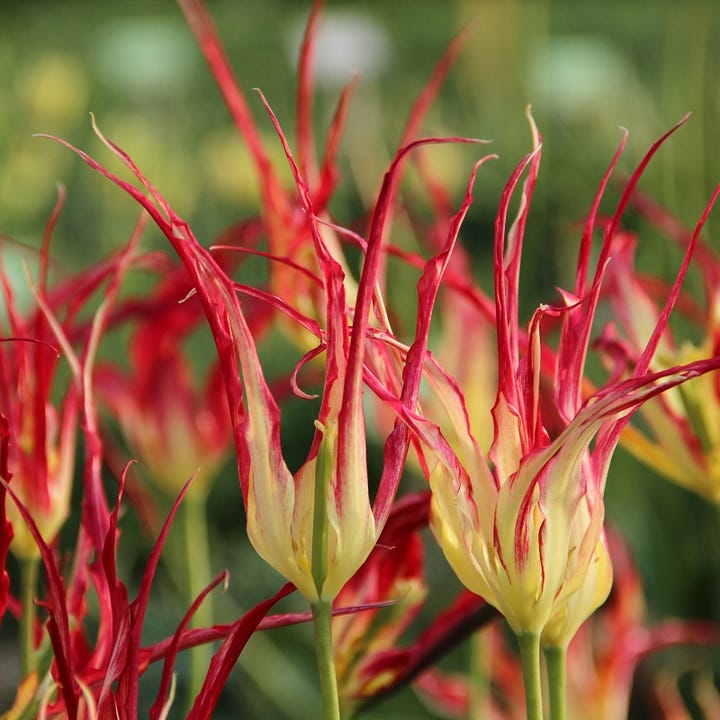
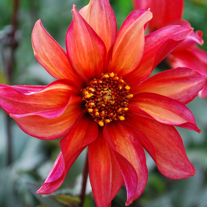
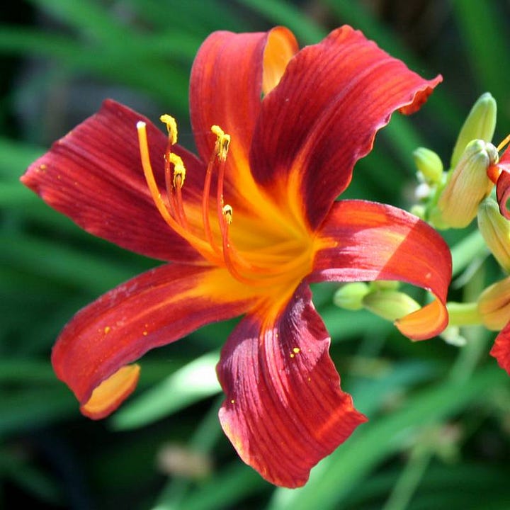
Another way to imitate the feeling of stained glass is to use plants whose leaves or flowers are jagged in shape (like Tulip acuminata and the afore-mentioned Eryngium), or have a painted feeling (like certain dahlias and daylilies).
3. Religious motifs
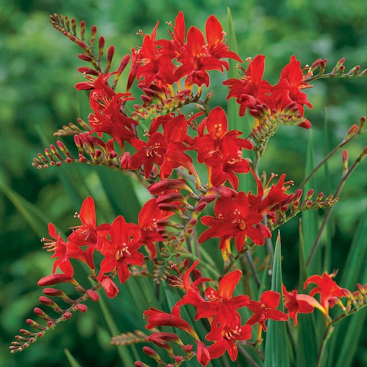
Finally, to honor the Catholic iconography of the cathedral windows, I chose plants that expressed some sort of religious motif, whether through their name, like St. John’s wort and Crocosmia ‘Lucifer’, or a reference to a biblical story—for example, I’ll place an apple tree right in the middle of the garden for some Garden of Eden imagery.2
Building the Garden
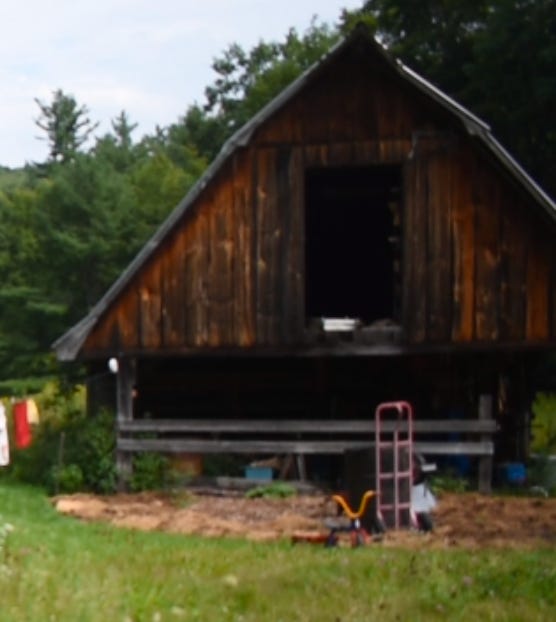
Last summer, I traced the arch shape onto the ground. I covered the existing grass with cardboard, then some biochar, then a layer of of goat manure from my neighbor’s barn, and then some woodchips so the toddler wouldn’t muck through the manure. After a full season of this lasagna treatment, the existing grass should be killed and the soil nicely enriched—ready for planting this spring.
I’m on a tight budget, so I’ll start plants from seed whenever I can. Some of the best selections don’t come true to seed, so I’ll buy a nursery plant or two and propagate them by cuttings and division until I reach the necessary populations.
Color perception is a strange beast: it’s influenced by nearby colors, and, in the garden, the quality and angle of light. So I doubt all of my plants will look quite so deliciously cobalt-y blue as they do in the catalogs. I’m sure plenty of the plants will appear purple. Some may be culled.
When the garden is finished, I hope visitors will say of it what Joseph Campbell said of Chartres cathedral: “Everything around me speaks of spiritual mystery. . . . My consciousness has been brought up onto another level altogether, and I am on a different platform.”
At the very least, it will be like nowhere else on earth.
Do you have any plant recommendations for the Chartres garden?
In fact, Chartres is almost entirely responsible for introducing Western culture to the color blue. Prior to that, blue was basically nonexistent. Red, white, and black were the three predominant colors in pigments and dyes, and between them provided the full range of Christian symbolism (purity, blood, sin, and all that good stuff). Blue was rarely used as a pigment, and almost never mentioned by writers. For instance, no classical authors mention blue as a color in the rainbow, and even well-known blue flowers like cornflower and iris were referred to as red or black in classical texts.
In the 12th Century, the Virgin Mary, who had hitherto been depicted wearing dark colors to symbolize her grief, began to be pictured in blue, which still expressed darkness, but with an added element of divine luminosity. The cult of the Virgin spread rapidly in the 12th Century and influenced the design of Chartres. The expensive cobalt used to tint the glass of Chartres was replaced in later cathedrals by cheaper copper and manganese, which create a different shade and aren’t as stable over time, which is why the stained glass of Chartres remains so striking and distinctive today.
Blue caught on and within a few centuries was the most popular color in the West.
Think of it: without Chartres, we’d have no blue jeans, no blue suede shoes, no rhythm ‘n’ blues, no Kinda Blue . . .
The lack of references to the color blue in classical and midieval European texts led to a prominent theory that those people were actually incapable of perceiving blue. I once listened to a casette of a talk by Peter Kingsley on this topic. He described how many ancient texts describe the sky as green, and pursued this topic of green skies to a truly mind-blowing conclusion. Unfortunately, I’ve never been able to find that talk online, nor have I found the original casette tape when I went back and looked for it. Perhaps it only exists in my imagination.
Robert A. Johnson relates a myth about Krishna (whose life story mirrors that of Jesus in many ways): as a child, Krishna was painted blue to hide him from the evil king’s minions who were hunting him “because their wicked eyes could not see that color.”
Suffice to say, blue perception is a delightful rabbit hole to fall down.
For much more on this subject, see Blue: The History of a Color by Michel Pastoureau.
For my apple tree, I chose the variety Jonathan, for 3 reasons: 1. Its deep red apples will fit well with my color scheme. 2. Its branching structure has always reminded me of an olive tree, further evoking holy land imagery. 3. It’s hella tasty—one of my top 5 apples.


Beautifully written! I can’t wait to see how the garden ends up. Larkspur are my favorite blue flowers.
Good stuff! Made me think of this podcast and book: https://pca.st/episode/1c5c2a91-e70b-4d81-89d5-6f5777cfb604